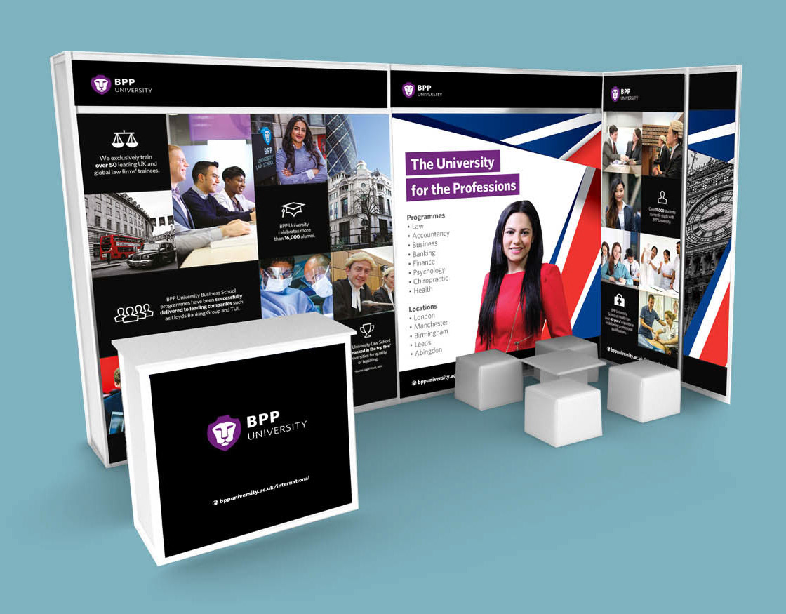
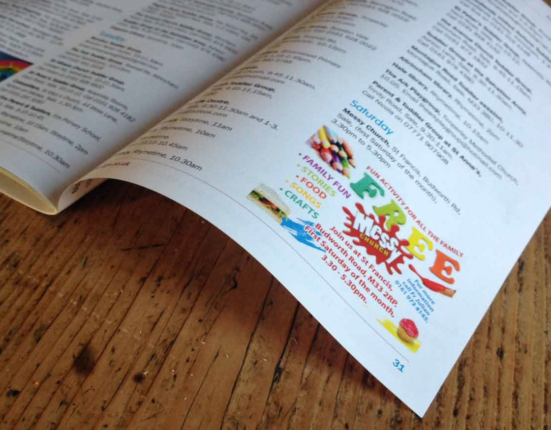
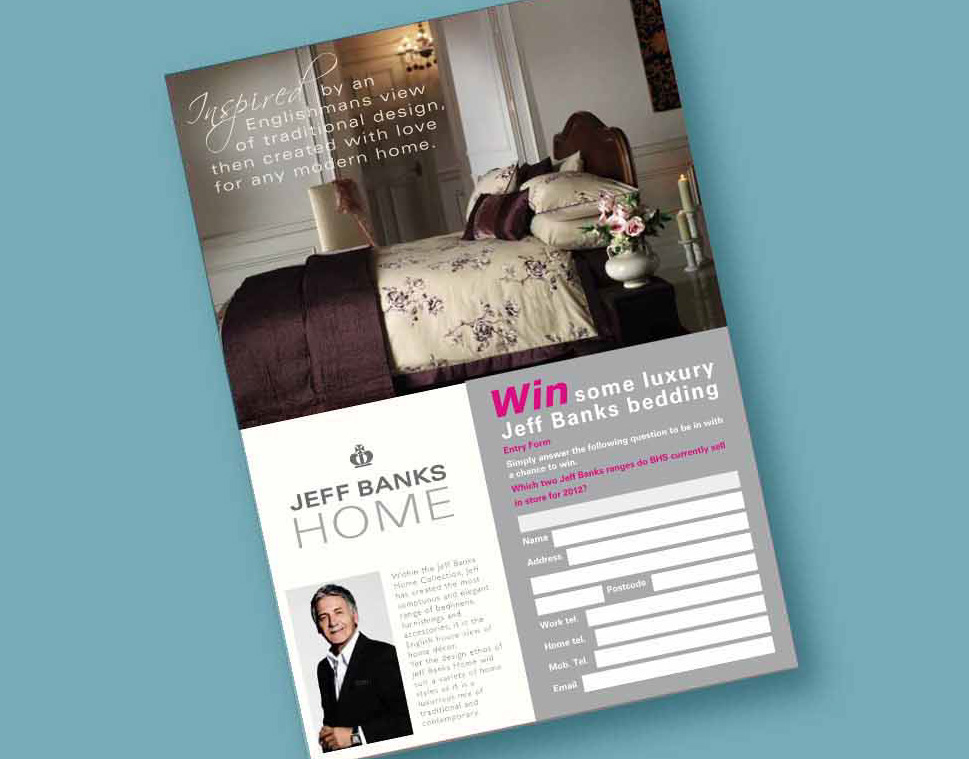
Packaging design for duvets, pillow, toppers, protectors and bedding. Also to create supporting collateral like POS, adverts, brochures, flyers and catalogue pages.
At Silentnight, we know the secret to a great night's sleep.
With over 60 years experience as the UK's favourite brand we have made it our mission to help everyone find their perfect sleep solution. Sleeping soundly is the bedrock of any person's sense of health and well-being, to help maximise performance in and out of work and enjoy a full and energised life.
To achieve this Silentnight is committed to reflecting their heritage and company ethos through all sectors of the business. Thorough brand checks on all their packaging means style guides are adhered to for all marketing and packaging collateral. A duty of comfort, care and quality is felt with any job Silentnight work on.
I was mainly responsible for designing new packaging for new products and product ranges under the Silentnight licence. We developed price points and tiering with in the brand so we had an entry level, general range, specialist range and luxury range. Each needed a different look whilst fitting in with the bigger brand. The packaging allowed us to push the guidelines whilst maintaining the feel of Silentnight.
After 10 years, I managed, among many other possibilities, to fine tune my skills as a designer to translate a style guide in to almost any print medium required. Not only have I worked on numerous print jobs but also for numerous clients, meaning I am used to looking at a similar message that needs to suit a particular client and fulfil any style guide restrictions. Managing both the expectations of the brand and the client can be a juggling act but with great communication you can work together so both parties are really pleased with the final results.
Working with a Superbrand meant that clients often want to see the full possibilities of selling a big name within their business. I was often asked to visualise any proposals we made to the client so the full impact of our offer was felt.
After 10 years, I managed, among many other possibilities, to fine tune my skills as a designer to translate a style guide in to almost any print medium required. Not only have I worked on numerous print jobs but also for numerous clients, meaning I am used to looking at a similar message that needs to suit a particular client and fulfil any style guide restrictions. Managing both the expectations of the brand and the client can be a juggling act but with great communication you can work together so both parties are really pleased with the final results.
When generating any POS, flyers, brochures, selling aides and adverts we had to follow the guidelines much closer and have a stronger flavour of the brand so the recipient felt like Silentnight brand were doing the talking and not my employer as a bedding supplier. Some adverts even had retailer brands to apply, as well as the Silentnight guidelines. This was obviously slightly more tricky but never impossible.
Working with a Superbrand meant that clients often want to see the full possibilities of selling a big name within their business. I was often asked to visualise any proposals we made to the client so the full impact of our offer was felt. This might just be visuals of the proposed new products or a full in-store visual of the whole bedding range. Sometimes POS would be designed to support the ranges in-store and these would be added to any visuals for extra branding and a stronger sell to the retailer and customers alike.
Available for Freelance
Your Designer
122 Norris Rd, Sale, Cheshire, M33 3GS
Tel: 07411 994468
Email: mrsreboyle@gmail.com
122 Norris Rd, Sale, Cheshire, M33 3GS
Tel: 07411 994468
Email: mrsreboyle@gmail.com
Got a minute, check out my portfolio.
© Your Designer 2018
